Back in the day when I lived in New York, my friends and I ran a website focused on creative pursuits and arty ideas called artlick.com. We were fascinated with this burgeoning place called the internet and the opportunities it presented to be creative. We had a keen interest in all artforms, especially writing and graphic design, but with very little experience of how to code, so we just jumped in and started building a site full of our own artistic creations, quirky installations and mad ideas (and we learned along the way). There were bucketloads of interesting projects and creations from the site that I’m hugely proud of, and I will post about them further in the coming year, but I’ll kick off with one of the most fun projects we ever embarked upon that we called Portrayal of an Artist.
We had borrowed an early digital camera (it captured photos on a 3.5 inch floppy disk inserted into the side!) from my friend Ravi. For us, it was a great way to creatively play with a futuristic gadget. So, one day on our lunch break we took a snap of me goofing around in the server room at work, and after a bit of digital doodling, we had a suitably silly looking album cover. Our shared love for music and album cover art then spawned an entire section of the site dedicated to this parody of the music industry. The idea was to make fun of the different styles of album cover art, and a broader sideswipe at self-important, stupid rockstars who put out an eclectic set of genres of music to reinvent themselves – with all the whims of moving labels; lack of quality control; wildly misjudged titles & lyrics.
Some of the photos are still really funny to me, and some are really beautiful and otherworldly. There are some particularly poignant photos in here of the old World Trade Centre too that proved to be a glorious backdrop to some of the albums. My friend Dave did such a terrific job with some of these covers – real gems that would look good on a shelf, and others that still make me laugh out loud. And as I look at them I often daydream about what the songs might actually sound like. I really should record them some day. There are also loads of fake album reviews to go with them, which I will also dig out and share at another time. But for now let me take you through some of the creative process that brought them to the world wide web. The back catalogue is absolutely vast, so I will post a chunk of them here today and share even more over the next two days!
Album: DATABANK
Singles: <ANTON> ; <PUNCHCARD>
As mentioned above, the first album came about when we pottered around the server room at our office. The word DATABANK was emblazoned on the original equipment itself, so we kept it and figured it would make a good album title. That then sparked the idea to create a couple of singles, which Dave used to hone his growing Photoshop design mastery.
I remember us spending huge amounts of time on coming up with the right titles for the songs, so they would fit well with the genre of the album (which we assumed was some kind of electronica). Although I have no idea where the name Anton came from. Also, there are little details on there that we added for our own amusement; we thought it would be funny that the album version of Anton was 34 minutes long, but the single was drastically edited in length. We extended the joke but reduced the running time even more preposterously for the Punchcard single.
Finally, the name of the record label was incredibly important (for this and subsequent albums) and I seem to recall Dave coming up with this one, saying that it felt right for an electronica record. Can’t argue with him. Even now.
Album: Footsteps in Chalkdust
Single: Walking home in the rain
The next album was a great marrying of old ideas with new ones. I had been playing with the idea of pretentious singer-songwriters and had written a sort of poem with ludicrously earnest titles a few years earlier (and pretentious sample lyrics) . My good friend Corrie Leane, a brilliant artist from Waterford, had designed some cover art for them during a poetry/painting collaboration we undertook a few years previously.
The record label (Thin Raft) was also a shared reference I had with Corrie, which came from a Jim Morrison lyric in The Doors song Texas Radio and The Big Beat– “I love the friends I have gathered together on this thin raft”. It was our shorthand for our friendship and artistic kinship. So it felt fitting given this new arty collaboration with a few close friends.
Album: Was?
Singles: Was! ; Memory III
The chronology of these albums (both real and imagined) is pretty fuzzy after all these years. We created these back in 1999 / 2000 I reckon, and this particular album was an attempt to create a singer songwriter album (hence the Thin Raft record label), where the singer had decided to go ultra pretentious and perform only on a piano. And all the titles had to have slightly avant garde sounding Steve Reich / Philip Glass sorta titles. This would be the type of album where critics would nod and agree that he began his more “experimental” phase, perhaps bridging into his next phase of electronica.
As a student and fan of the German language (word nerd alert), I suspect I was playing with the word “was” which means “what” in German, and the past tense of the verb ‘to be’ in English. Which probably explains why the album title has a question mark and the single title has an exclamation mark. Or perhaps I wasn’t thinking of any of those things.
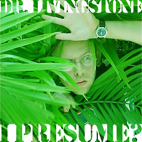
Album: Dr. Livingstone I Presume
Singles: Cane Toad Nightmares
This album was one that was sparked by an impromptu photoshoot on our lunch break (I know this because my fake watch from Chinatown says it was almost 1pm). I spotted a large potted plant outside a store on Broadway and thought it would be funny to appear from it as if I were an intrepid explorer. The phrase just jumped out at me from something I was reading at the time. I still love the way Dave laid out the title on the cover, with the old school “A-Team” style lettering.
We then thought there would be something inherently funny about having LOADS of singles of the Cane Toad Nightmares, given the propensity of cane toads to reproduce so much. In addition, we felt that the artwork had to have something of a psychedelic “Apocalypse Now” kind of feel to them. The harsh neon colours were a very deliberate choice as I recall. Again, this was deemed to be a Purification Records release, so some kind of electronic vibe to it, perhaps even dancey. I’m pretty sure the inspiration for that record label was Warp Records, as we were listening to a lot of Boards of Canada at the time. For the record, I’m still not sure what on earth a Cane Toad Nightmare is. Maybe Dr. Livingstone will know when I see him.
So, that’s phase one of the Kalle Ryan albums from Portrayal of an Artist. Oddball treasures for sure. For more dizzy album cover delights and the process of creating them, read Part 2 of the musical odyssey here


2 responses